How To: Reading Color Charts
In this tutorial, you’ll learn how to read a color catalog. This tutorial is provided by Faranak Beauty Salon.
Instructions:
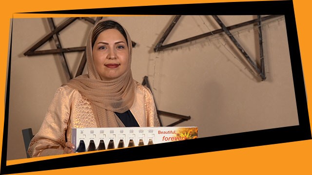
Greetings. I’m Faranak Hasanejad. I’m the administration for Faranak Beauty Salons.
We have three main colors: Blue, Yellow, and Red. We get other colors by mixing these three main colors together. For example, mixing yellow and blue will give us our green color. We get purple if we mix red and blue. If we mix yellow and red, we will get orange. We use these to neutralize our main colors as well.
Based on what I told you about primary and secondary colors, we’re going to try reading catalogs. We get our natural colors from the mixture of our three main colors. All colors are based on these. From number 1 to 4, we have more blue pigments, from 5 to 7 we have a higher number of red pigments which are our warmer colors, and from 8 to 10, the majority of the pigments are yellow. These are also categorized under warmer colors. Colors 1 through 4 are categorized as colder colors.
The number to the left of the fractal shows the tone and basis of the color. The number immediately after the fractal shows the primary background color, and the second number after the fractal shows our secondary background color. To understand primary background colors or shadows, you should first familiarize yourself with color tones. These color tones include gray, gold, purple, red, green, brown, Mahanoy, and copper. These colors are usually added to the main tone to create a background or shadow.
I already told you that the color tones could include gray, gold, violet, red, green, brown, Mahanoy, and copper. When you want to read a catalog, you have to pay attention to two important factors. The first is the number of those colors and the second one is the alphabetic notation. For example, gray is denoted with “A” as in Ash. Colors are usually denoted with the first alphabet in their name. Purple is usually denoted with “V" which stands for violet. Red is denoted with an “R". Each of these colors has a number assigned to them. For Ash, for example, number 1 is used. Number 3 is assigned to the variety of the color gold. For purple Number 2 is assigned to violet. Number 6 is assigned to red, number 4 is for copper, number 9 is for chocolate color, and number 7 is assigned to green.
Olive green is usually given the number 2, and in some catalogs, number 9. These are categorized as our cold colors. Olive green is usually used to neutralize a red background or reflection in hair. If you have and unwanted red shadow on a hair, you can use olive green to neutralize the effect. Gold is categorized as a warm color and can give the hair a shining effect. It’s very often used in our color mixtures. It’s usually assigned number 3 and in some catalogs number 5. These are our warmer colors are very useful in our color palette.
If you see a number after the fractal being repeated twice, it means that color is more powerful and has a higher potency. This means if this color is applied, the shadow or effect of this color will be higher on the hair. Beige is made from a mixture of purple and gold. The number before the fractal shows the basis or primary tone of that color. By mixing gold and purple on different color tones, you get you beige color with different tones, depending on what color basis it was applied. Caramel comes from mixing copper and gold. Same as before, the two colors are mixed on different basic tones to create different spectrums of caramel color. You can’t get a caramel color on a basis below number 5, because below this level the majority of your pigments are blue and the mixture with warm colors like copper and gold will not produce beige and be neutralized. This is why we can get our caramel color only with a basis from level 5 and above.
For chocolate and brown colors, the mixture is mahogany and gold. These two colors are mixed using different color tones starting from level 4. Since as we said before, brown is made of the mixture of our three main colors, red, blue, and yellow. Even though there is a high percentage of blue pigments in a level 4 base color, the mahogany and gold neutralize it and gives us this dark brown color. As you go up, you have more red pigments and you get lighter brown colors.
Copper has number 4 assigned to it and denoted by letter “C”. It’s one of our warmer colors and is a mixture of red and yellow that also create orange. On lower color bases such as 4, it’s harder to see the orange, but as you move up to 5 and above, you can see the orange background being more and more visible. If you don’t have copper in your palette, you can mix orange and yellow to get your copper color. Our mahogany copper color is created from a mixture of copper and mahogany. If you don’t have this color on your palette, you can mix the two basic colors to create your own mahogany copper color. Number 5 is assigned to our mahogany color. Mahogany can be based on lower base colors like level 4. Since mahogany is a warm color and there’s a majority of red pigments, you will see a higher red background color here. Our bronze color is made of copper and purple colors. After level 7 for your base color, you can’t make bronze, because for the bronze color you have to have some more orange and red, and if you go up a level for your base color, you’ll get more yellow and that will neutralize your red and orange since the colors will be lighter.
Your coffee brown is made of gray and mahogany. Gray and mahogany, or red and blue, will give us our coffee brown color. Since it’s a dark color, it can use lower level basic colors like level 4 up to 7 or even 8. Nevertheless, 8 is a very light color and you’ll have much more yellow which might not be a suitable basis for coffee brown. Level 7 is a more suitable spectrum. Gold mahogany is a mixture of gold and mahogany. It’s represented with 5 and 3 after the fractal. Three is the number representing gold color and mahogany with number 5. Like copper, coffee brown, and mahogany, this color can start with a level 4 base color. This way your brown color will have more red in it. Therefore, it can start at base 4 but cannot go above base 7. Because as I said, above base 7 you have lots of yellow pigments and the color will not present itself because this is a warm color and there are lots of red pigments in the mix.
Number 6 and the notation “R” is reserved for red. This is true of every catalog you might face. If you see the number after the fractal repeated twice, it means that the redness in this color is heightened. Based on what we said so far, you should always pay attention to two factors when reading a catalog. One is the number and the second is the alphabetic value.
This concludes our tutorial. I’ll see you in our next tutorial.